Ultimate eCommerce Homepage Guide: Make Your Online Sales Growth Unstoppable
Posted by. Disrupt Tech. April 18, 2022
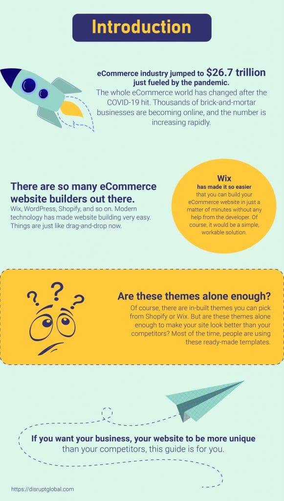
The whole eCommerce world has changed after the COVID-19 hit. Thousands of brick-and-mortar businesses are becoming online, and the number is increasing rapidly. The eCommerce industry jumped to $26.7 trillion just fueled by the pandemic.
Customers spend more time on window shopping and browsing online stores. Small or big, whatever your business might be, you must have an online presence. Having an effective eCommerce platform has become a necessity, not a luxury anymore.
There are so many eCommerce website builders out there. Wix, WordPress, Shopify, and so on. Modern technology has made website building very easy. Things are just like drag-and-drop now. Wix has made it so easier that you can build your eCommerce website in just a matter of minutes without any help from the developer. Of course, it would be a simple, workable solution.
To get more advanced and effective eCommerce solutions, you should seek the help of a professional web developer. For several reasons, you might need the professionals’ help. For example:
▪ There should be no glitches in the functionality of the pages.
▪ Pages should not take more than 1 or 2 seconds to load.
▪ The website should be SEO-friendly.
▪ Easy to navigate
These are all the technical jargon. But there is a saying that “The first impression is the last impression.” Your website should look good and be easy to navigate.
Of course, there are in-built themes you can pick from Shopify or Wix. But are these themes alone enough to make your site look better than your competitors? Most of the time, people are using these ready-made templates.
If you want your business, your website to be more unique than your competitors, this guide is for you.
Let’s jump in to make a great Homepage for your website. The article will discuss the must-have elements of a homepage that will make your online sales growth unstoppable.
Why Home Page is Important
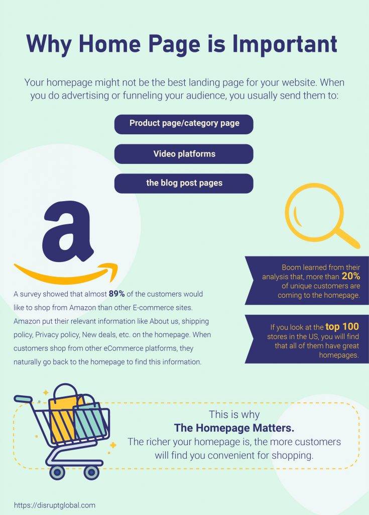
Your homepage might not be the best landing page for your website. When you do advertising or funneling your audience, you usually send them to:
▪ Product page/category page.
▪ Video platforms.
▪ Or, to the blog post pages.
This is the common scenario, right? Yet, Boom learned from their analysis that, more than 20% of unique customers are coming to the homepage. Why is that happening? Why users are navigating back to the homepage?
A survey showed that almost 89% of the customers would like to shop from Amazon than other E-commerce sites. Also, there are other popular choices like Apple, Home Depot, Netflix, Walmart, etc. Many marketers are saying that these top stores are training customers how to shop online and use eCommerce platforms.
Top stores like Amazon put their relevant information like About us, shipping policy, Privacy policy, New deals, etc. on the homepage. When customers shop from other eCommerce platforms, they naturally go back to the homepage to find this information.
This is why the Homepage matters. The richer your homepage is, the more customers will find you convenient for shopping. If you look at the top 100 stores in the US, you will find that all of them have great homepages.
Winning Homepage Elements
Now let’s talk about the elements of the homepage that you need to have. And these elements are needed to be placed on the homepage for a reason. Everything will be discussed below:
Multiple Header
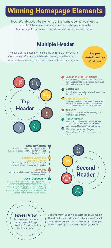
The double or triple header on the top has become the new trend in eCommerce platforms. Zappos started it and now it’s all over. Multiple headers mean you will have two or more headers where you can show much useful info to your visitors. Generally, one header is used for navigation. You can use another header for community joining, showing USPs, etc. Here are the top elements you can use in your multiple headers:
useful,
Top Header
▪ Logo in the Top-left Corner: It is very useful, not just showing your brand name and logo. Site-viewers expect this logo as a link back to your homepage.
▪ Search Box: This will allow your visitors to search for anything they need on your website.
▪ USPs or Guarantee: Sowing your unique selling proposition e.g. fast shipping, 15-days-return policy, or VIP section. These will add more credentials to your site.
▪ Tag Line: Tell your audience what they mean to you or what do you do for them.
▪ Phone number: It is very important because customers can easily communicate with you. A lot of the companies get their orders from phone calls.
▪ More Information Pages: Account, log in, Help Center, etc. adds more value.
Second Header
▪ Store Navigation: You can add your store navigation in this header. For example, Home, our store, Contact Us, About Us, etc.
▪ Shopping Cart in the Top-right Corner: Customers expect to have the shopping cart menu in the top right corner on the header.
▪ Live Chat: If you have live chat support, you can add this to the second header.
▪ Opt-in Opportunity: You can use this section as an opt-in opportunity, asking your customers to join your community. You can give them a discount too for this purpose. This opt-in will help you to get many email subscribers. Don’t forget to make the opt-in button look different so that it stands out on the site. You can use this method to get your customers in your pre-purchase automation process.
Foveal View
People’s eyes can see a certain level of things at a time. This is called the Foveal View. Clustering many things in the header section will make it difficult for the viewers to navigate. Try to keep standard space between elements in your header section. People tend to leave the site if they find everything cluttered.
Main Banner
We see this a wide banner wherever site we go. A banner usually shows who you really are. A banner may contain a few of the following things:
▪ Your best products
▪ Short story of your brand
▪ Your tagline
▪ A Call-to-action (CTA) that will take you wherever you want. It can be like ‘Shop Now’ or ‘See Our Products’. Use this CTA button wisely. Also, use a different color so that it stands out on the banner.
If you want to show two or more photos in the banner, you can make a banner slideshow too. But online shoppers tend to scroll more. So instead of showing all banners in one place, you can use multiple banners on multiple folds of your homepage.
Headline and Intro
The headline section contains a major headline that really catches the attention of your audience. You can use a short headline and explain it more in a short paragraph(s). The main purpose of the headline is to talk about your product, your brand to your customers. Here are the few things you would like to talk about in this section:
▪ Talk about why your product is different from competitors. Show them your USPs.
▪ Tell them why your brand matters. How your brand is creating a change?
▪ Share any story related to your product or brand.
Category Image Navigation
Using pictures for navigation is a trend in eCommerce. People tend to browse more using the phone.
45% of the window shoppers use smartphones while making a purchase. This is why making your homepage mobile-friendly is really important. When you have many categories of products, show them in slide format. This way they can swipe easily and look for what they want.
Another way of categorizing is lifestyle categorizing. You can show different types of lifestyles and how your products are benefitting that lifestyle.
Featured Product Slider
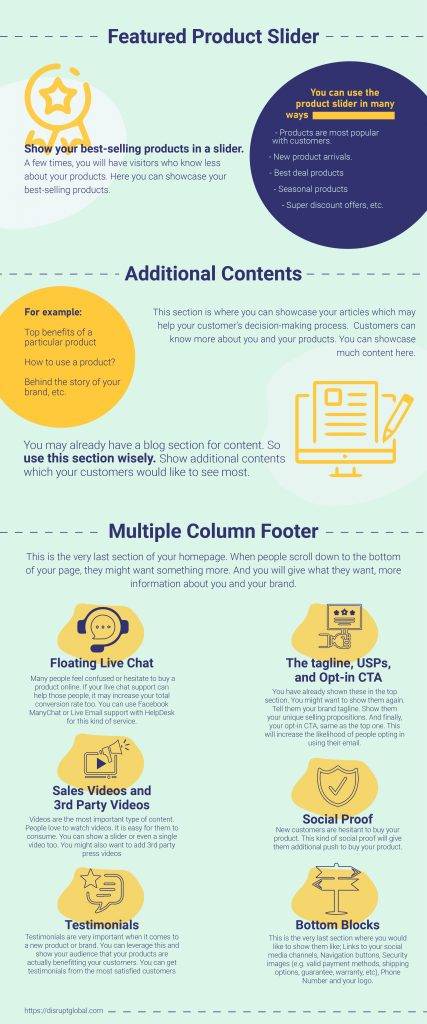
Show your best-selling products in a slider.
A few times, you will have visitors who know less about your products. Here you can showcase your best-selling products. You can use the product slider in many ways:
▪ Products are most popular with customers.
▪ New product arrivals.
▪ Best deal products
▪ Seasonal products
▪ Super discount offers, etc.
Additional Contents
This section is where you can showcase your articles which may help your customer’s decision-making process. Customers can know more about you and your products. You can showcase much content here. For example:
▪ Top benefits of a particular product
▪ How to use a product?
▪ Behind the story of your brand, etc.
You may already have a blog section for content. So use this section wisely. Show additional contents which your customers would like to see most.
Multiple Column Footer
This is the very last section of your homepage. When people scroll down to the bottom of your page, they might want something more. And you will give what they want, more information about you and your brand. Here are the elements you can show in the footer section:
Floating Live Chat
Live chat is very important in the eCommerce business. Many people feel confused or hesitate to buy a product online. If your live chat support can help those people, it may increase your total conversion rate too. You can use Facebook ManyChat or Live Email support with HelpDesk for this kind of service.
Sales Videos and 3rd Party Videos
Videos are the most important type of content. People love to watch videos. It is easy for them to consume. You can show a slider or even a single video too. You might also want to add 3rd party press videos where other people are talking about your products. 3rd party videos increase the credence of your products.
Testimonials
Testimonials are very important when it comes to a new product or brand. You can leverage this and show your audience that your products are actually benefitting your customers. You can get testimonials from the most satisfied customers and
Social Proof
This section is from your valuable customers. It is another form of credence. For example, you can ask your customers to show them how they are using their products in their lifestyle. You can then add these videos/pictures.
New customers are hesitant to buy your product. This kind of social proof will give them additional push to buy your product.
The tagline, USPs, and Opt-in CTA
You have already shown these in the top section. You might want to show them again. Tell them your brand tagline. Show them your unique selling propositions. And finally, your opt-in CTA, same as the top one. This will increase the likelihood of people opting in using their email.
Bottom Blocks
This is the very last section where you would like to show them the following:
▪ Links to your social media channels
▪ Navigation buttons
▪ Security images e.g. valid payment methods, shipping options, guarantee, warranty, etc.
▪ Phone Number and your logo.
These four are the very items your customers would like to see in the footer section.
Conclusion
The above-mentioned elements are the very important ones you would like to add to your homepage.
Try these out when you create your website. Try to be creative with it. An ideal homepage will be your gateway to your “unstoppable online sales growth.”
